We’re full steam into the build now; the main house is locked up which means I can shift my focus inside and start transforming this build into our family home!
The master bedroom takes up a large proportion of the upstairs floor area, so this is where we’ll start sharing from… As much as we talk about this being a parents ‘retreat’ with a three year old and an (almost) two year old, we’re under no illusion that this won’t turn into a ‘family’ room! No doubt most mornings we will wake up in the same bed as I’m sure many of you will relate to. That aside, this will be a space that will evolve over time and we’re looking forward to enjoying it to it’s full potential as time goes on and our family grows up.
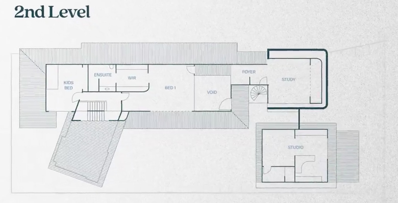
Upstairs Floor Plan
When you’re building a home using manufactured frames it’s important to get everything right – especially when you’re doing a second story. Kyal has spent the time detailing all the frames from National Frame & Truss early on, so we have a good base to start in this space, everything’s fitting like a glove and Kyal’s happy as I haven’t made any changes as yet 😉 We had to do some forward planning when it came to where our air conditioning vents and units (InterMech Pty Ltd) would sit in the ceiling space, and for me this meant ensuring that there was enough space for my curtain tracks to run all the way back to the wall (priorities, right?!) After plumbing rough in (we use Zeal Plumbing) and electrical (Sparky & Co) we’re ready for Gyprock®!
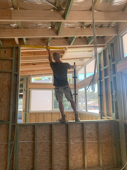
Kyal standing in the window over the void area
This bedroom has an abundance of natural light with highlight windows along the whole north and east aspects. The ceiling is raked and when it comes time for gyprocking we need to ensure that the quality is top notch. All this natural light is going to show up any flaws so we’ve used Gyprock® Superceil™. This product sets the standard for plasterboard on ceilings as it’s made with fibreglass to increase strength, prevent sag and reduce glaring light issues, creating a flatter ceiling.
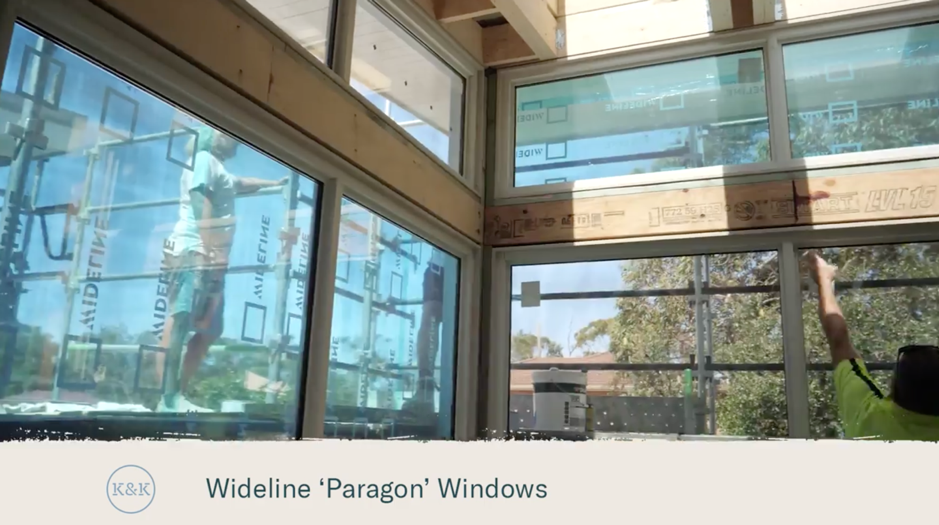
Second story highlights
For me, there are a few key features in this master bedroom. One of them is the abundance of windows on the eastern aspect. Being on the second story means we look out over the trees, which creates such a beautiful outlook. We’ve used highlight windows from the Wideline Paragon range and Ascend Forty Sliding windows in a Textura® Surfmist matt finish; all from Wideline Windows. The window on the north looks down over the void and we’ve ordered shutters for this window that we’ll fit later.
Another key feature in this bedroom is the curved wall that leads from the entrance of the bedroom around to the walk in robe – it really softens the feel of the space and feels luxurious.
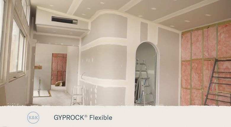
Curved wall leading into the walk in robe. You can see we’ve left allowance for curtains to run to the wall where the air conditioning unit and vent will sit.
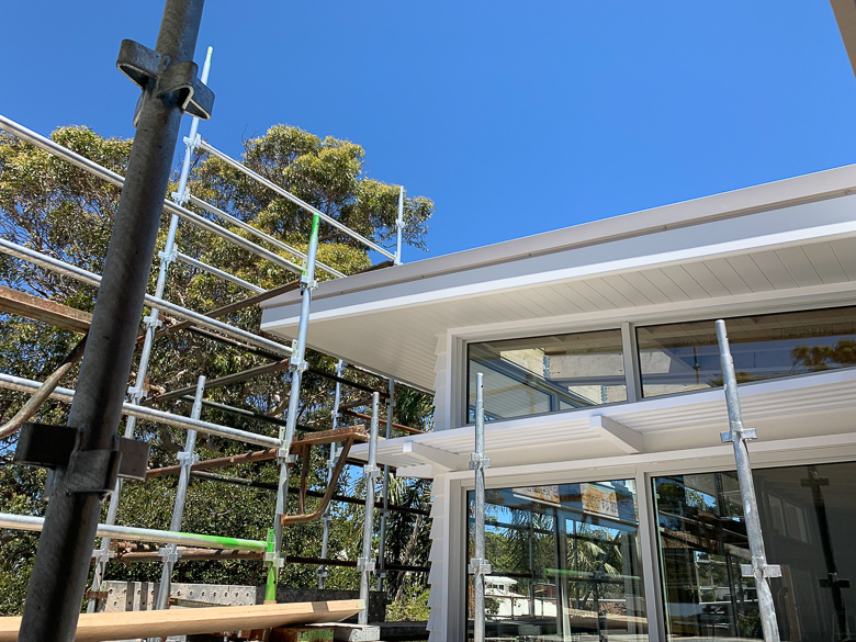
Highlight windows along the north and eastern side of the house.
We’ve used Easycraft Easy VJ 150mm board on both the internal northern wall and behind the bed – one of our favourite products to use for adding subtle texture to a space, especially for a coastal feel. All walls in this space are painted with Taubmans 3-in-1 ‘Alpine Snow’; a warm white that feels fresh but not too stark.
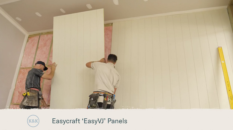
Easycraft panels being installed – the bed will sit against this wall.
Coastal Skylights have installed our opening Velux Skylights in the ensuite and walk in robe. In our experience, they’ve always been worth the investment for the amount of natural light and wow factor they bring to a space.
Living in our Block apartment in Melbourne we fell in love with the underfloor heating and ambient, cost effective heat it provided. We’ve laid underfloor heating in our ensuite and I’m already looking forward to winter showers with a warm floor!
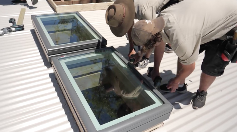
The boys installing Velux Skylights
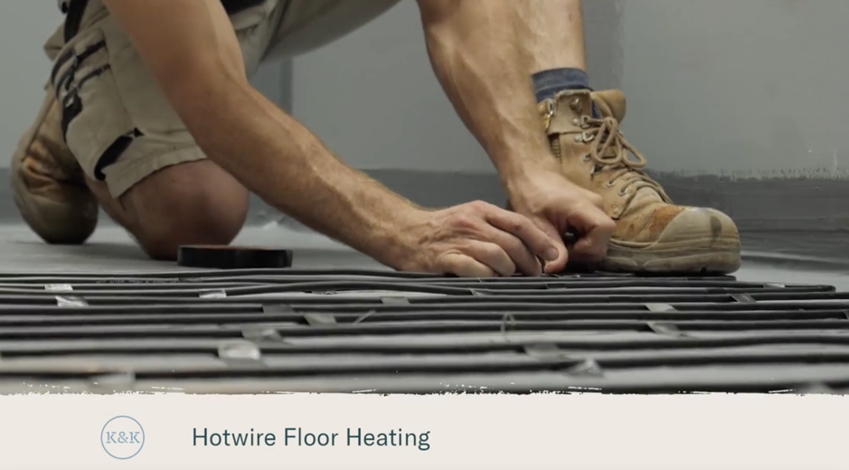
Underfloor heating being installed in the ensuite.
When it came time to selecting cabinetry for the walk in robe, Jasper Design Group were great at selecting inclusions that we wouldn’t have necessarily thought of ourselves. For example, the ceilings are 3m high so they’ve had some Hafele Pull Down Hangers installed in the higher cabinetry. For the cabinetry, we’ve chosen Polytec ‘Angora Oak’ Woodmatt finish.
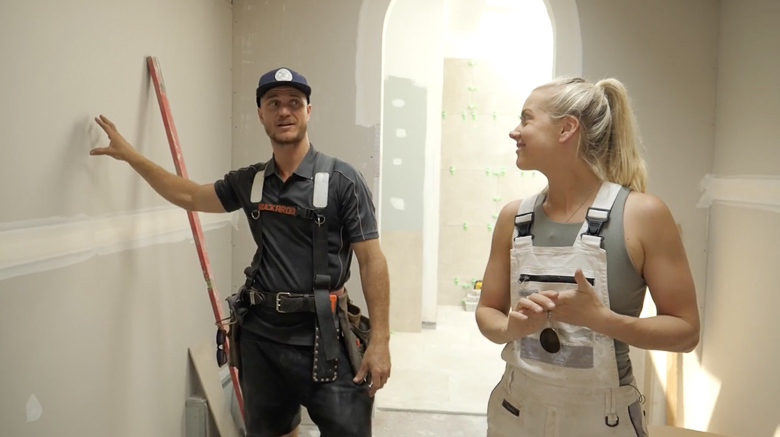
Kyal negotiating cupboard space in the walk in robe…
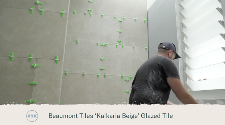
I’ve kept the look a bit more minimalistic than I would normally go for our bathroom tiles. The beautiful ‘Kalkaria’ tiles from Beaumont Tiles are 1200x600mm and are such a beautiful texture and colouring. They work well with our ‘Australian coastal meets Mediterranean villa’ theme.
For the ensuite vanity, we couldn’t go past the Angourie Vanity from our Loughlin Furniture x KK Homewares collaboration. Edstein Creative Stone are installing the Eternal Calacatta Gold benchtop in the suede finish with washbasin from Cosentino. We’ve chosen a 100mm-thick look. Similar to our guest studio, I’ve had Hannah from MayClay Ceramics make some of her amazing Stone Raku Wall Lights for either side of the mirror – a 1200mm Alura Arch mirror, also from our Loughlin Furniture x KK Homewares range.
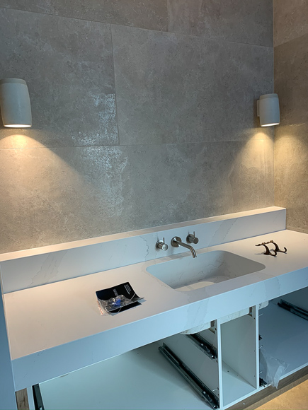
Ready for vanity drawer fronts and mirror.
I had initially assumed we would use timber floors in our master bedroom as that’s what we’ve done for our last three renovations, however, Kyal was adamant he wanted carpet and I must admit, the thought of playing with the kids on the carpet was appealing… What won me over though, was when I went shopping and found the Cavalier Bremworth 100% wool carpet in the ‘Galet’ colour. When I did some further research, I found that it’s 100% sustainable and renewable fibre and that wool is also able to naturally absorb and filter airborne volatile organic compounds (VOCs) – unwanted toxins and odours that can cause irritation – sold!
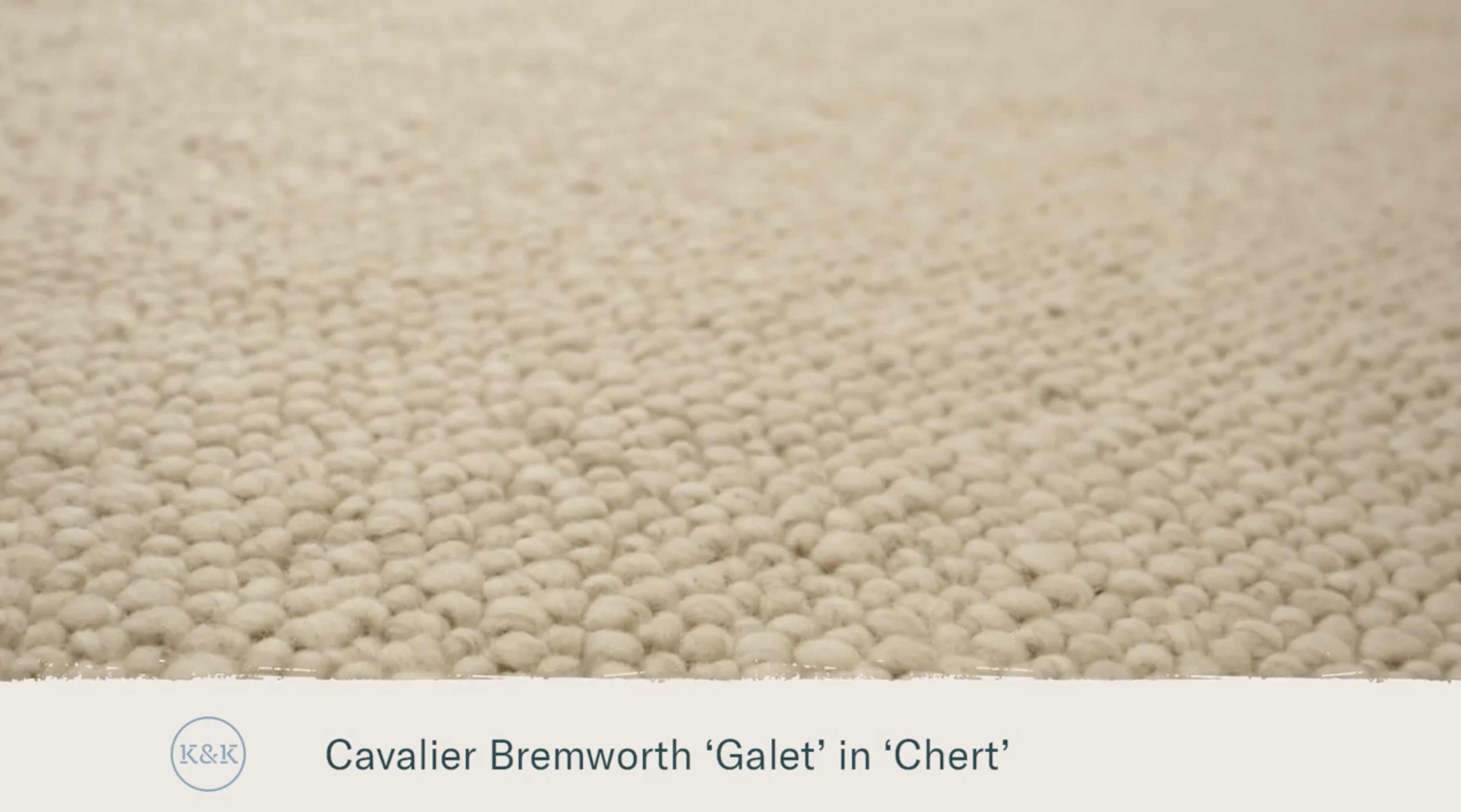
Our carpet choice inspired by our coastal ‘sandy’ colour palette
As beautiful as all this natural light is, we obviously want to be able to make the room dark sometimes! For the eastern windows, we’ve chosen floor to ceiling block out and sheer curtains for a luxurious, hotel feel. We’ve chosen ‘Anstey Oyster Stone’ for the blockout, and ‘Alexandra Smoke’ for the sheer – both from DIY Blinds.
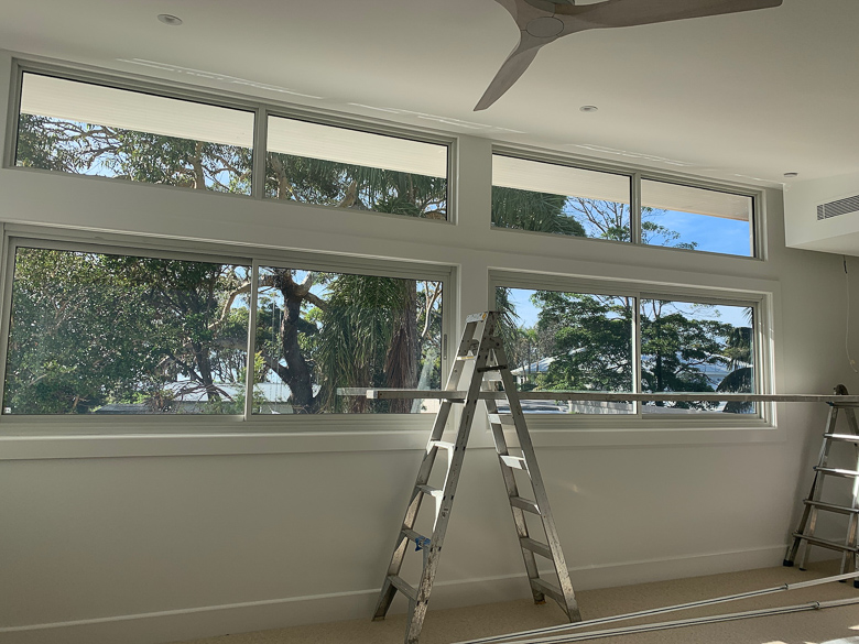
All ready for DIY curtain installation.
Styling will evolve in this space over time, but one thing we wanted to incorporate straight away was a touch of the old shack into this bedroom. Kyal has recovered the existing hardwood frames of the shack and dressed the old timber right back to its beautiful original state. It was a little ‘red’ in colour for my liking, so I’ve used a ‘Black Japan’ stain on the timber. It’s certainly a statement that we love and are proud to have included.
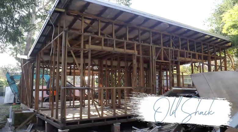
Original hardwood frames from the old shack.
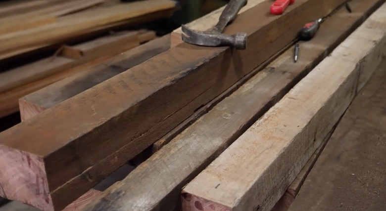
Kyal recovered the hardwood and restored them to their original beauty to build our bed frame.
I look forward to the many memories we’ll create as family in this retreat…I also look forward to the week-long sleep I hope to have in here when this project is completed!
Click here to to watch Blue Lagoon Build Episode 4 – The Hideout
Blue Lagoon Build series is proudly brought to you with the support of RAMS Home Loans.