This family room reminds me so much of our family room growing up. The focal point is the big, comfy and well-loved sofa that has, years later, seen better days. A room that has had memory after memory made. But…the time has come for a refresh! This is the family room of Sabika and Sean, who have two children – now 18 and 19! They enjoy entertaining in this room, but would love it to be a more sophisticated and social room. Currently, everything is pushed up against the wall facing the TV; hence the furniture layout is not conducive to conversation. The elephant in the room (as always) is the TV – which currently doesn’t have a true ‘home’. And to make matters worse, Sean has just purchased a HUGE new TV – so finding a new storage solution for the TV is paramount.
When recceing the room, it was obvious there were a lot of small pieces that were sentimental, all with a story to tell. Together with James Treble, the brief was to update the family room to create a more social and ‘grown up’ space infused with the family’s memories.
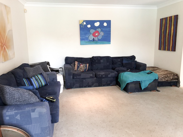
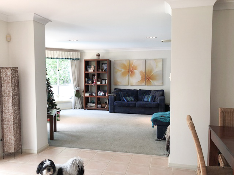
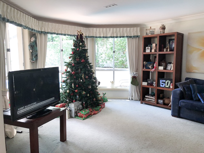
Kyal and I were inspired by the outlook to the pool and wanted to create a resort style abode with ocean inspired hues. The starting point – paint! The room was painted with Taubmans ‘Grey Moon’, and trims with Taubmans ‘Miss Universe’.
Next up, we focused on the layout. The new (HUGE) TV needed a true home, so to conceal the fact that it’s so big we’ve used a full wall of IKEA cabinetry. This cabinetry works so well with our chosen wall colour – giving the illusion that it’s built-in, and is the perfect place to style all the family’s keepsakes and photographs.
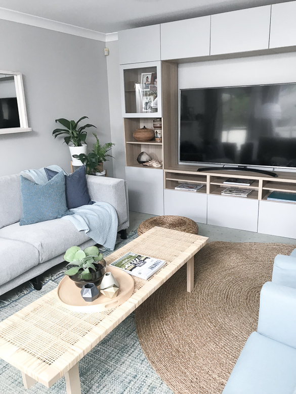
AFTER: New Ikea cabinetry to house the TV and display the family’s keepsakes
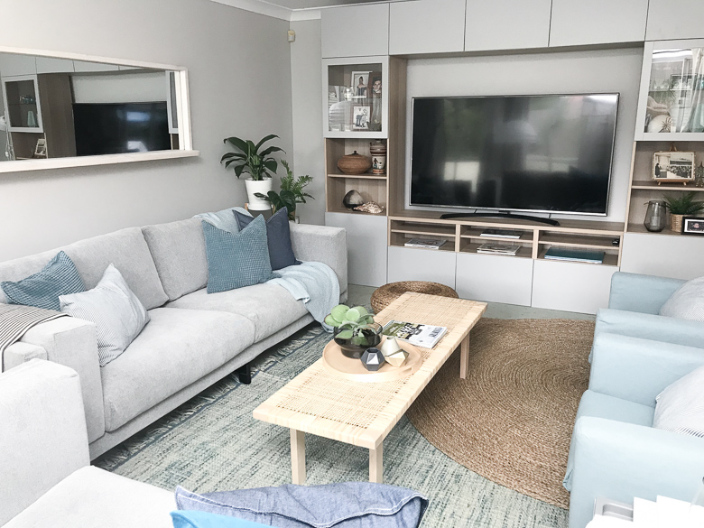
AFTER: We’ve flipped the layout, moving the TV to the opposite end of the room
When choosing seating, we’ve moved away from the modular and gone for a more ‘sophisticated’ approach. Two sofas and armchairs – all facing each other – encouraging people to talk! I LOVE this coffee table, not only because it’s made with rattan, but the rectangle shape works well to ‘connect’ all the furniture pieces – which helps to create a more ‘social’ and inviting space.
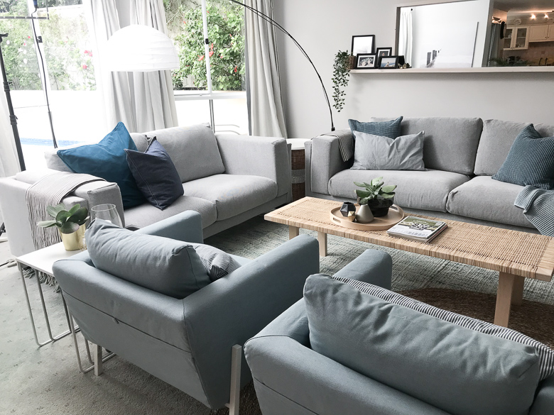
AFTER: A new, more social furniture layout
To add warmth and texture, we’ve layered up the rugs – which is a GREAT idea if you don’t have the budget for a large or custom size rug. Greenery and cushions of various fabrics assist with adding the warmth, interest and style that this room was screaming for!
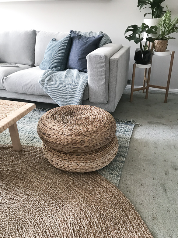
AFTER: Layered rugs and lots of texture
As with all our Living Room Design Challenges, we were asked to incorporate a custom build. Kyal and I decided on a custom mirror that would fill the large wall you see as you walk into the room, incorporating a mantle for family photographs. The bay window lets in so much natural light, and we really wanted to capitalise on this. Mirrors have the ability to really open a room up and give the illusion of more space. In this case, the mirror reflects the kitchen and dining living area – which helps to connect all these rooms – the perfect addition to this space!
To watch the full episode, including James Treble’s take on the room, and to find out who won the challenge – head to The Living Room on TenPlay.