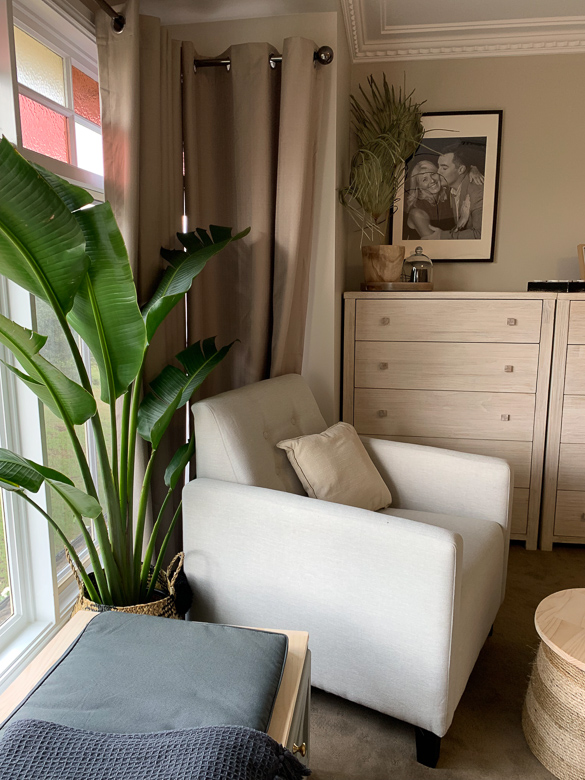
As the busy parents of two teenaged boys, Karen and Adam had put the styling of their Master bedroom on the back burner. They’ve been busy with school sports, running their business and enjoying the whirlwind of raising kids, but now it’s now time to invest a little more time in themselves. Given that we spend a lot of time each night sleeping, (unless you’re me and have a baby going through a sleep regression…), a bedroom makeover is the perfect place to start!
When we first walked into the original room, Kyal and I were greeted with the most beautiful bay window. A lot of homes in this suburb are situated on acreages, hence the outlook is serene and full of trees.
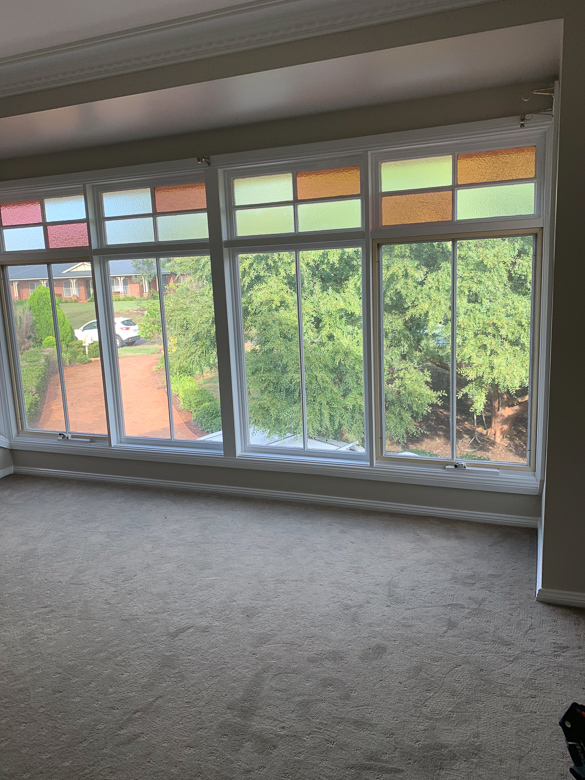
The bay window captured our eye as we first walked in, but wasn’t being used to it’s full potential
The bedroom is a generous size and was sparsely furnished, and both Karen and Adam agreed they could do with more storage. They wanted the room to feel less empty and more like a retreat from the rest of the home. Their exisiting bed consisted of an ensemble with no headboard and some flat pack bedside tables.
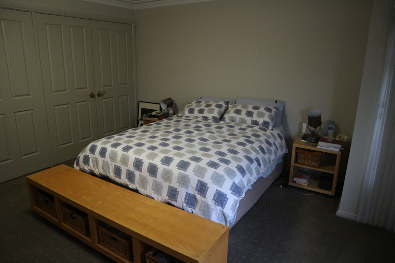
A simple ensemble with no headboard
With all this in mind, our first port of call was choosing a bed that took this room to the next level! We chose a grand quilted linen and timber bed frame from Snooze which instantly added a luxurious look and feel, together with bedside tables and a blanket box in a whitewashed finish. I think it’s important to note here that I deliberately chose a different finish for the bedside tables and storage box. When selecting bedroom furniture, it can be easy (and convenient) to choose the ‘package deal’ and in a lot of cases, that’s perfectly acceptable. But mixing different finishes can be a great way of creating interest, and ensuring your room isn’t a ‘cookie cutter’ version of something you’ve seen in a showroom.
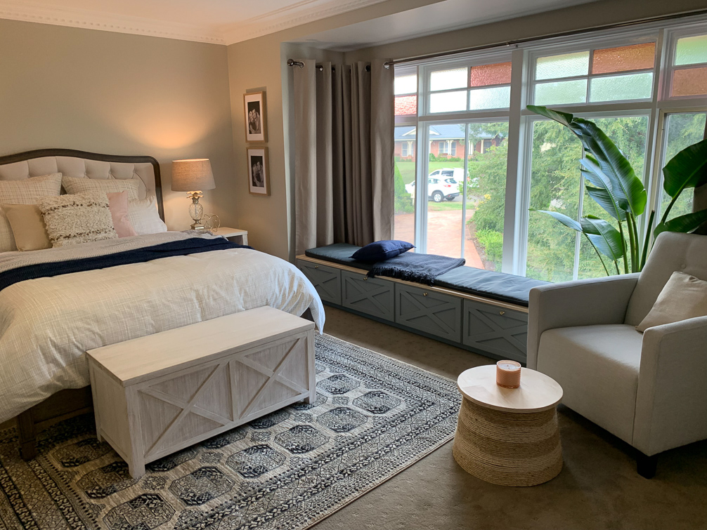
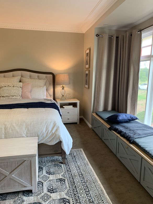
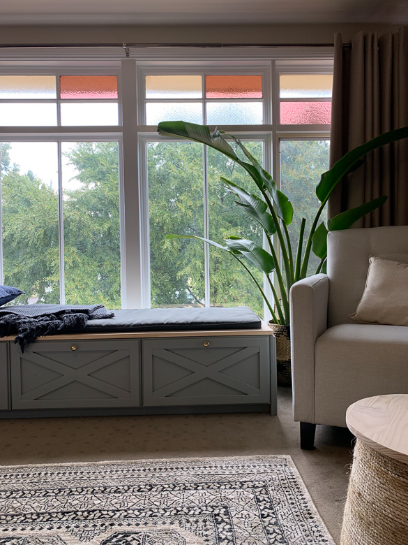
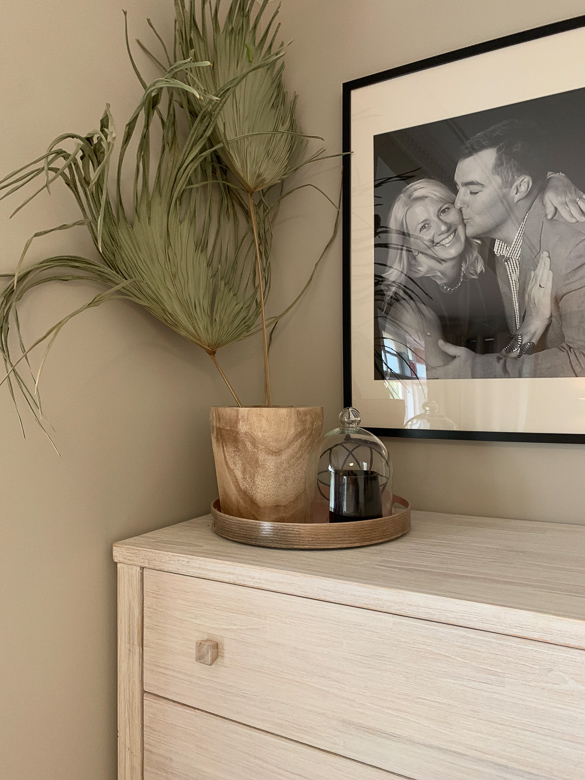
Our second port of call was the bay window, and how we could best utilise this space to its full potential. We designed a custom window seat which ran almost the length of the window, leaving room for an armchair to tuck into one end of the bay area. Added storage was incorporated by including drawers along the entire length of the window seat, which we customised with decorative crosses to tie in with our ‘Ocean Grove’ blanket box. A feature rug from Bunnings and some re-styling of Karen and Adam’s existing accessories and photos added those extra touches of personality that the original room was lacking.
To watch the full episode and for all suppliers and product information, head to The Living Room on TenPlay.
