Omar and Isabelle are two down-to-earth parents who are busy working and raising their two young children. Omar generally works 6 days a week, so when he has a full weekend of they like to get away in their caravan. This has meant there is very rarely time to spend updating things around the home, and their bedroom has suffered accordingly.
Although the room is quite big, it has become a cluttered space. They’ve bought some great storage solutions and furniture over the years, but because they’ve been purchased without an ‘overall plan’ in mind, it’s resulted in an awkward mish-mash, and the space is definitely not being used to it’s full potential. In Omar’s words, “It’s a bit of a downer walking in there”.
They enjoy having a large bedroom to escape and have a cup of tea, or watch TV. They would love for the room to be a parent’s retreat that has the feel of being away in a nice hotel room – so with this brief in mind, Kyal and I, along with James Treble, set off to create two new looks for the room – with Omar and Isabelle to choose the winner.
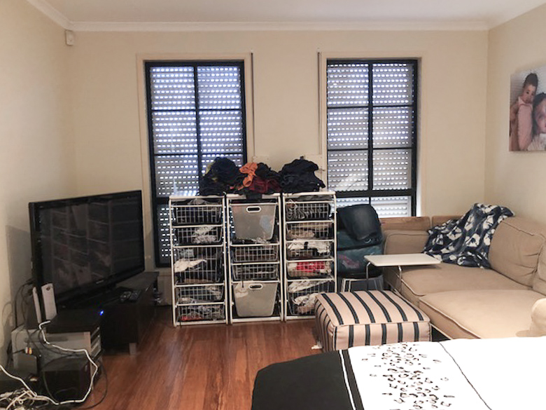
BEOFRE: Having furniture and storage unit positioned against the window blocked a lot of natural light
First things first – and if you’ve read any of our makeover blogs – it ALWAYS starts with the layout. Positioning the king-sized bed and working out a more efficient use of the floor space was a priority. Next up was the overall theme of the room. I began conjuring up images of resorts with neutral, calming colour and decor. Our furniture supplier for this challenge was IKEA Australia and I found some great selections inspired by coastal resorts around North Queensland.
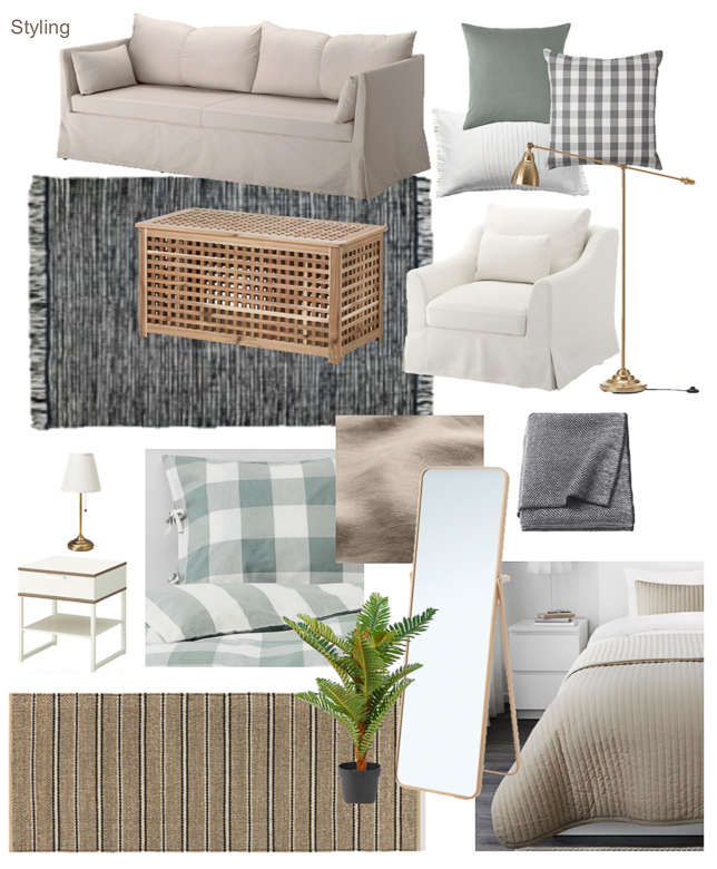
Our resort-inspired styling selections – all from IKEA Australia
For our custom build, we designed a resort-inspired canopy to sit over the king-sized bed. We wanted Omar and Isabelle to feel as though they’d stepped into a luxury hotel room – and what screams luxury more than a canopy bed?? (Well….besides maybe room service, champagne and a spa bath…)
To create the canopy, we built a timber frame using pine posts, and painted them white before attaching curtain rails. This was then secured to the ceiling (using existing beams in the roof) and we hung sheer curtains from the frame.
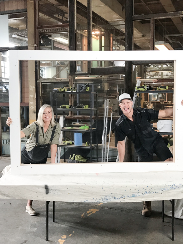
DURING: The timber frame prior to curtain railings being installed
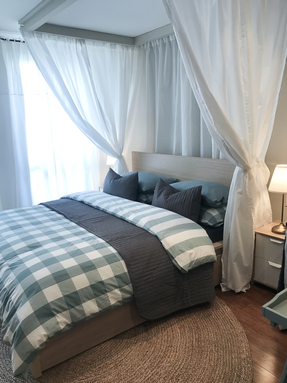
AFTER: The canopy complete with curtains hung
One of the biggest changes to the room was the addition of the sheer curtains from wall to wall along windows at the end of the room. It softens the whole look of the room and hides the dark block out shutters installed underneath. There is an existing walk-in robe which has a great amount of hanging space, however Isabelle and Omar have quite a few clothes that require drawers – so we’ve chosen three IKEA drawer units and positioned them all in a row. They look great and give the illusion of built in cabinetry – at a fraction of the cost! So much storage!
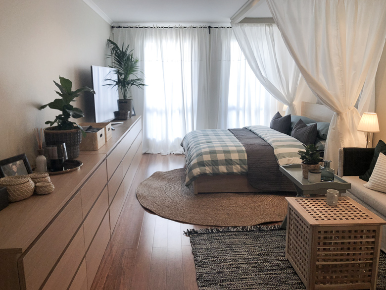
AFTER: Plenty of storage with drawer units placed together, giving the illusion of built-in cabinetry
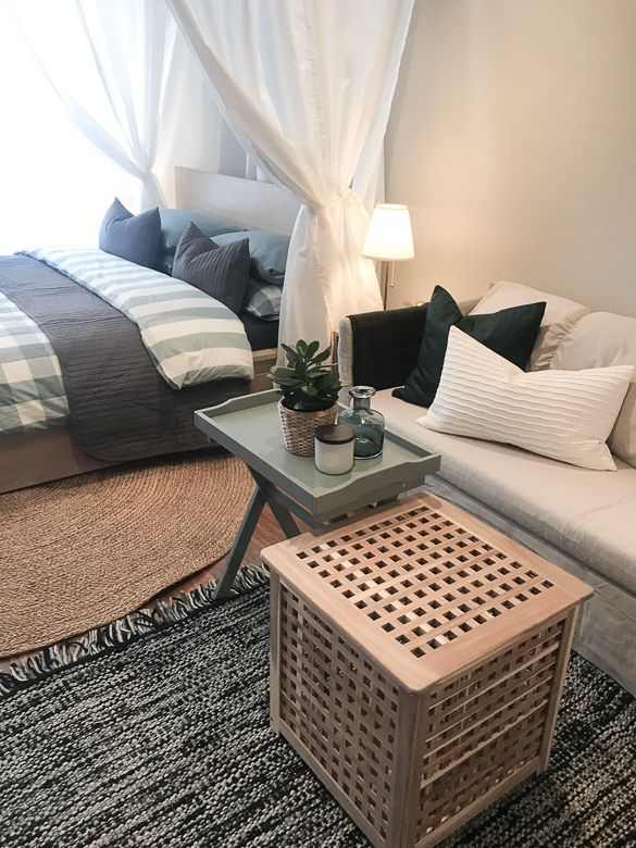
AFTER: A sitting area to relax and enjoy tea together
Overall, a great transformation! It certainly felt like you had stepped into a resort master suite. To watch the full episode, and to see James Treble’s spin on the same room, head to The Living Room on TenPlay.