What a year we’ve had! Late last year, we were getting itchy feet to renovate again, so when this house came on the market we were so ready! Check out ‘Episode 1 – The Beginning’ to see where we started.
While most were looking to knock this house down, all we could see was potential. Starting with a red ‘brick box’ there were a few key design elements that have really helped to transform the exterior of this house.
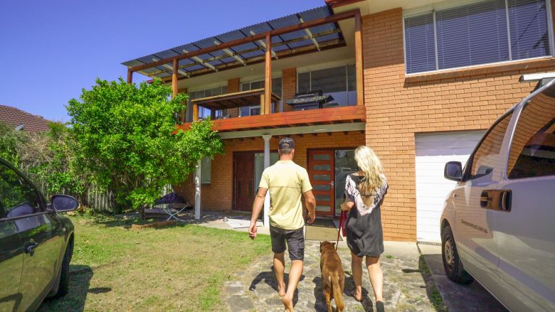
BEFORE: The red brick box
To start with, we removed the brickwork down to the window sill and replaced with CSR Cemintel ‘Scarborough’ weatherboard. This really broke up the brick texture and added to the ‘coastal’ feel. We extended the pitch of the roof as well as the deck at the front of the house to incorporate a gable roofline. The new Colorbond ‘Windspray’ roof was one of the first colours we had to decide on, and it helped to set the tone and palette for the rest of the renovation.
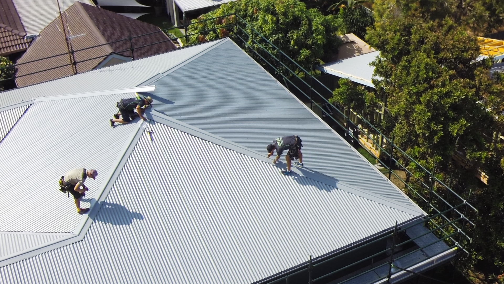
Installation of the new Colorbond ‘Windspray’ roof
The addition of the double garage at the front of the property adds privacy to the north-facing front yard. Given that the garage door is one of the first things you see, we wanted this to have an impact. The barn style cross panels add just enough detail and texture without taking away from the overall look.
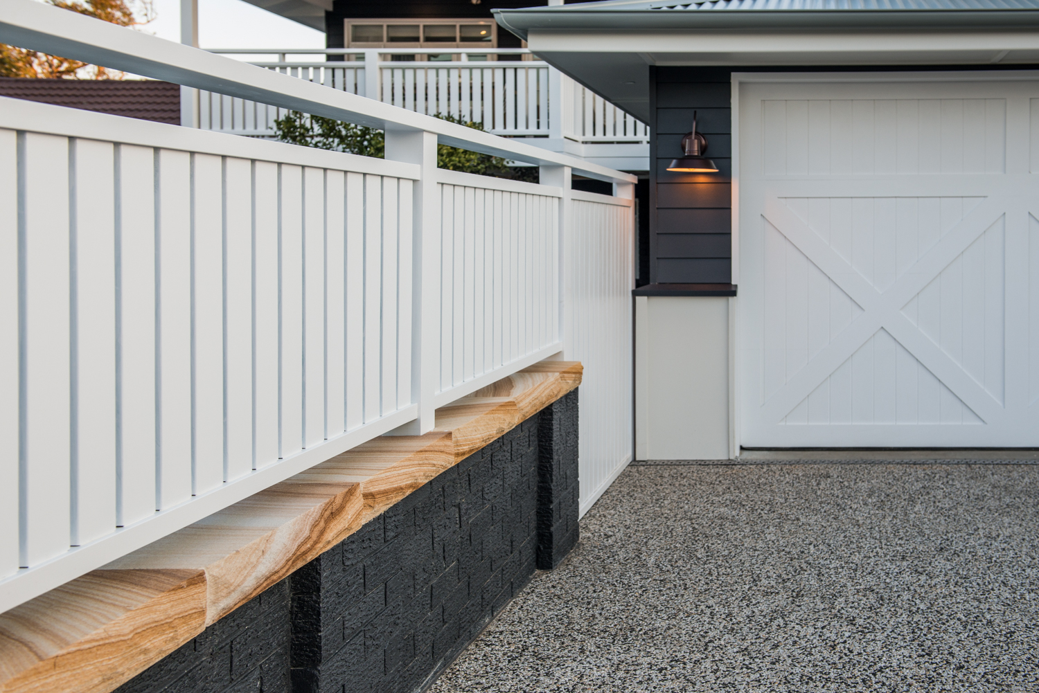
New double garage at the front of the property
As with any project, the finishing touches can make all the difference to the overall look and feel. We love the Warm Ash Travertine laid in a French pattern which brings you from the front gate all the way inside. Kyal is pretty chuffed with his tiling efforts and I have to admit that he’s done an amazing job!
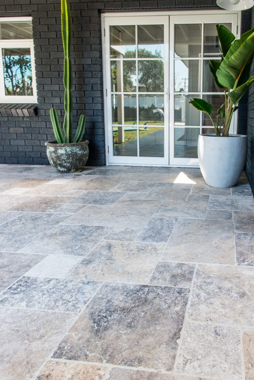
Warm Ash Travertine from Beaumont TIles laid in a french pattern
One of the key reasons we purchased this property was the potential to build a second dwelling at the rear of the property with driveway access down the side of the block.
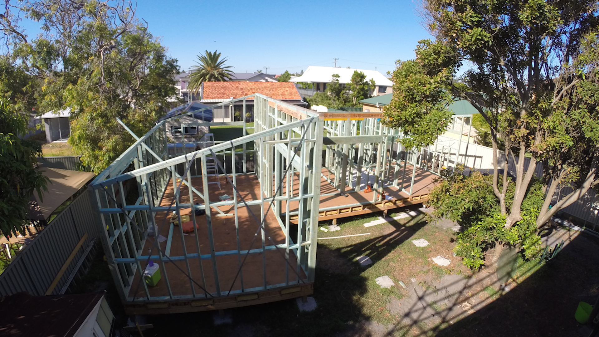
Studio taking shape
The two bedroom studio has been designed to holiday let and now that it’s complete I want to book myself in! I’m sure this space will evolve over time – we want it to be a fun space for people to enjoy a quiet weekend away and create memories.
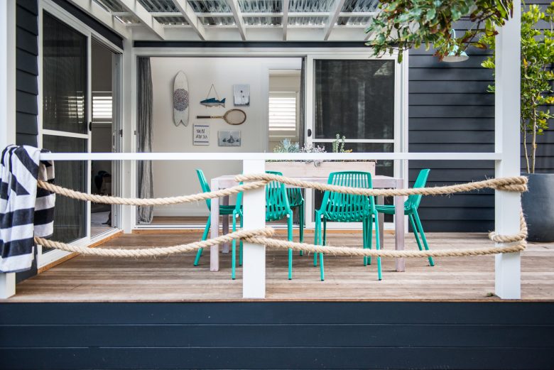
Relaxed space to enjoy the studio
The studio kitchen is one of my favourite rooms. It has a relaxed feel, the colours are beautiful and there is so much space for the perfect weekend away.
The island bench acts as a dining table in this space, and is a great transition into the studio living room.
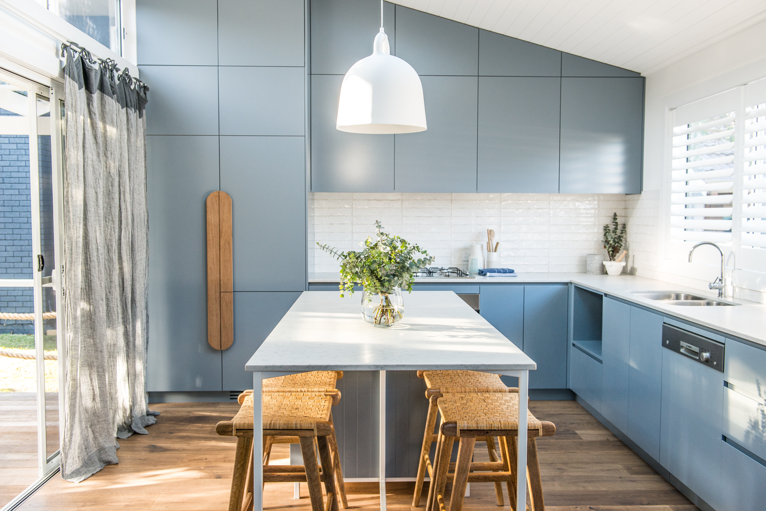
Studio’s kitchen
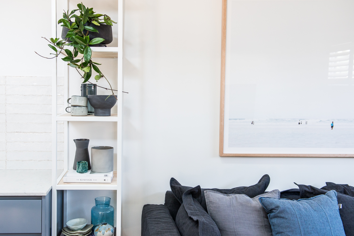
Studio’s living area
You just can’t go past raked ceilings to create the illusion of more space – and this is most evident in the studio’s bathroom which also acts as a laundry. The height combined with the Velux windows and mirrors allow for so much natural light!
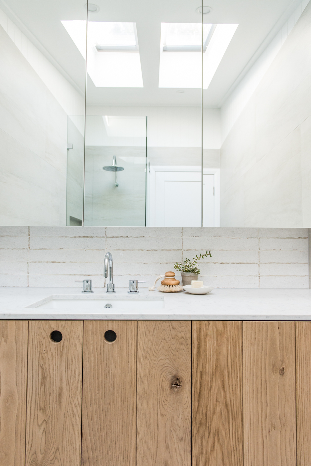
Studio’s bathroom & laundry
With this project complete, we’re looking forward having the home revalued. The plan has always been to continue renovating so yes, call us crazy, but we are on the hunt for a new project! First and foremost though, we’re looking forward to a break and welcoming our little one into the world! Stay tuned for Series 2 in 2017!
Check out all the photos in the gallery.