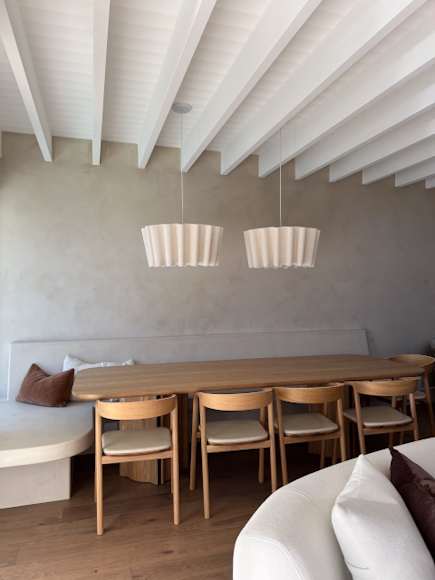
It’s the most exciting spaces of any new build or renovation for us… the Kitchen, Living and Dining area! It’s the space where most memories are made so it just makes sense that when we’re designing these rooms, we really are thinking about how we would use the spaces. We want them to be practical, but also to be super impressive!
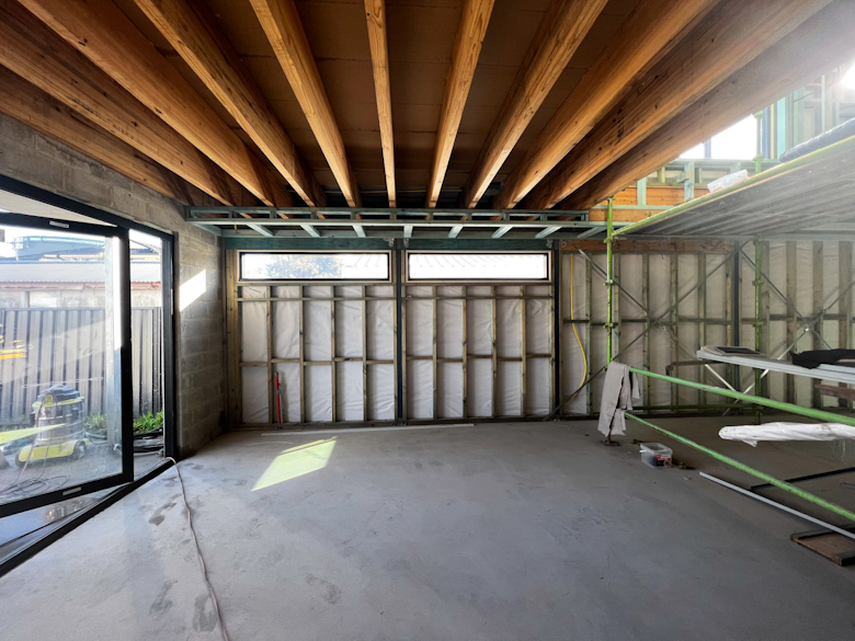
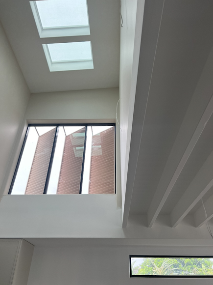
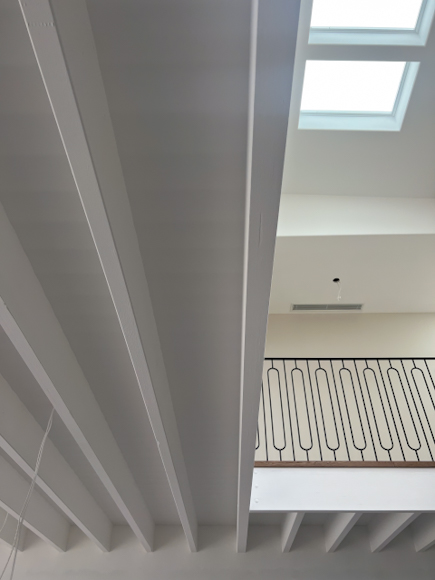
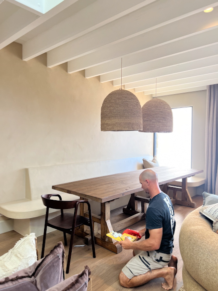
One of the first decisions we made in the living room was the inclusion of the Hyne Beams. Not only are they structural, but they’re also such a beautiful addition to the overall aesthetic. The plan was to paint House 1 beams white and stain the ones in House 2, however as the homes progressed we changed our mind on this and ended up painting them white in both homes. The next big decision in this space was deciding on the type of door we wanted to open out onto each backyard. We opted for the Wideline Paragon Bi-Fold doors so that opening them allows maximum free-flowing access between the indoor and outdoor living spaces.
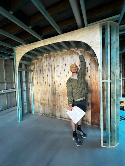
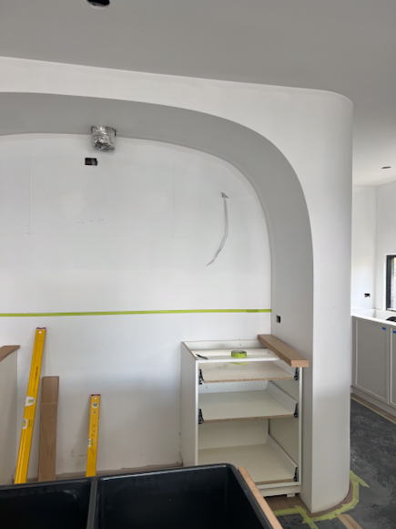
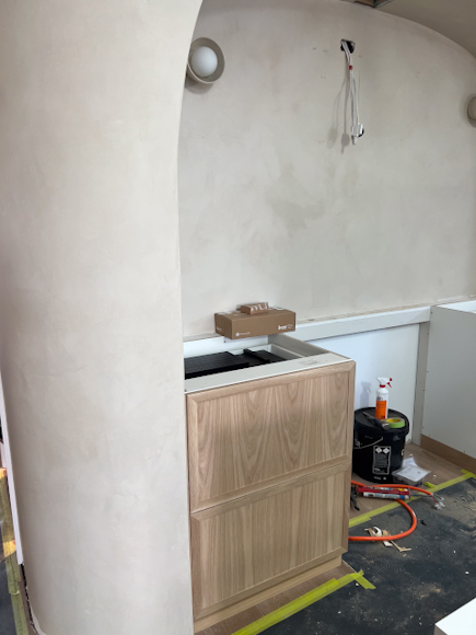
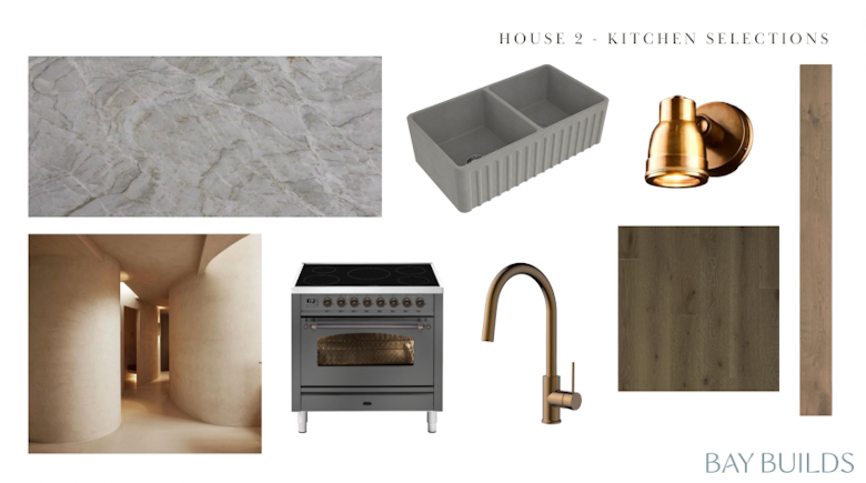
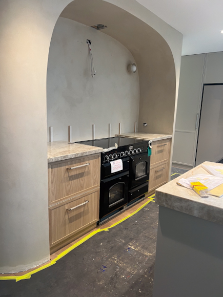
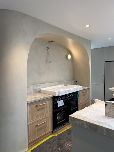
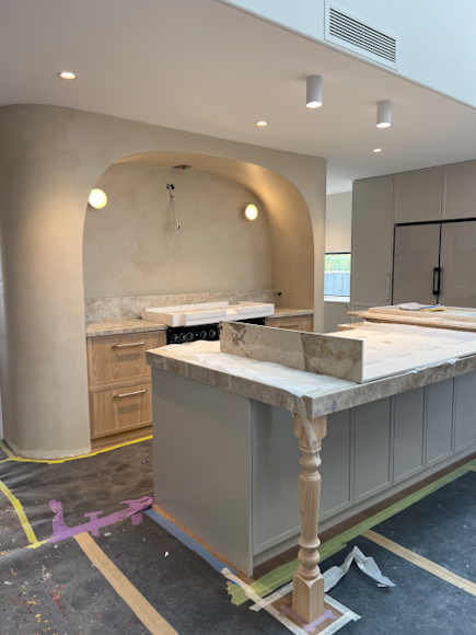
Opposite to these doors we’ve designed a curved wall for the oven, rangehood and cabinetry to sit within. They create a stunning focal point for each kitchen, and we thought it would be a nice touch for the Cemher microcement finishes that run along each hallway to be used here. In House 1 we’ve used Cemher El Àlamo 01 and in House 2, El Àlamo 02.
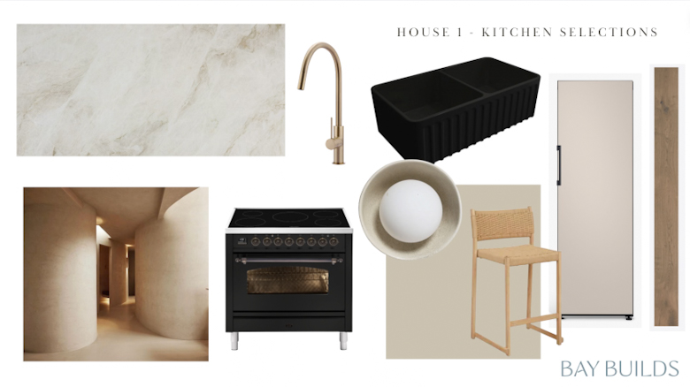
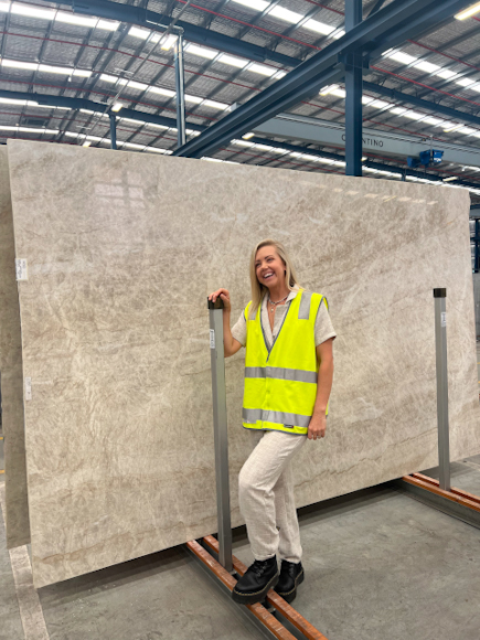
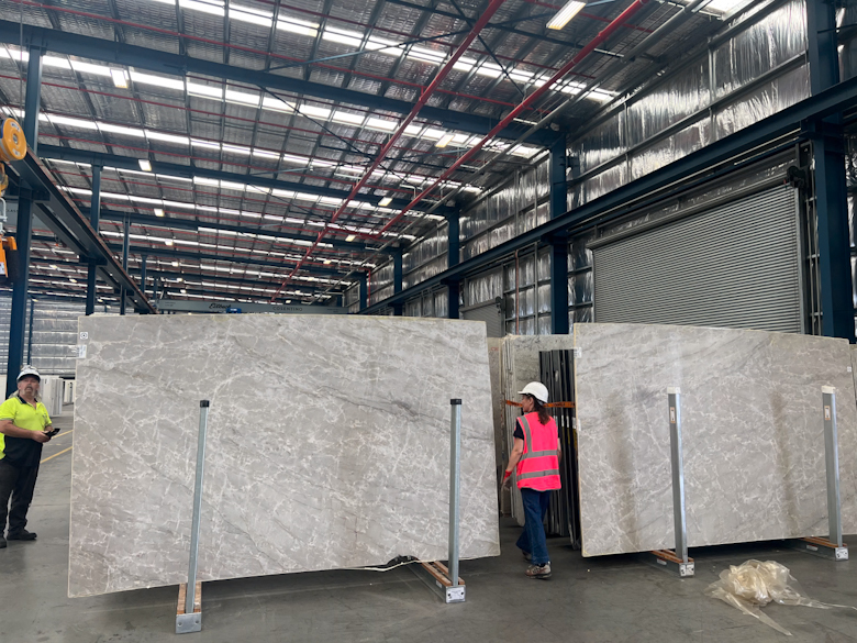
For finishes, House 1 Kitchen has a light colour scheme that is juxtaposed with darker selections including a black oven, sink and of course the black window frames that are present throughout the build. When it came time to selecting the stone we locked in Cosentino Sensa ‘Taj Mahal’ for the both the benchtops – including a splashback – and the rangehood. At one of our site visits, the Edstein team suggested that we curve this rangehood which was such a genius idea and a credit to their passion and craftmanship. These rangehoods have since become a favourite element of these kitchens!
Beachside Kitchens are installing the shaker profile cabinetry in House 1. For the colour, we’re going with Taubmans ‘Siberian Husky’ and we’re pairing that with some Light American Oak drawers by Loughlin Furniture, champagne tapware from Beaumont Tiles and styling with kitchen stools that have a coastal feel; the ‘Anton’ barstool from Globe West in a colourway called ‘natural papercord/light oak’.
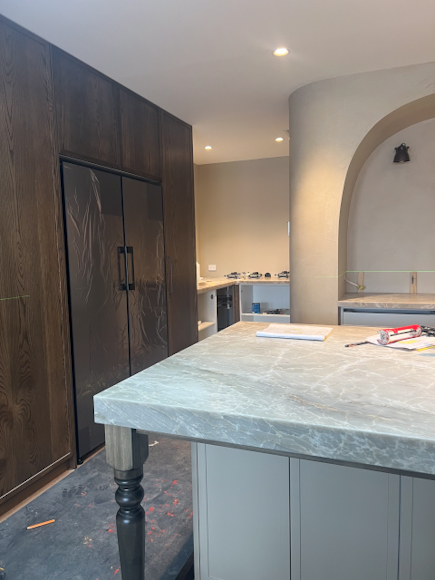
Over in House 2, the most obvious difference between the two kitchens is the darker palette of the cabinetry, and the stone selection. The majority of this cabinetry is Aged American Oak by Loughlin Furniture and on the island we’re using Taubmans ‘Time Capsule’. The Cosentino Sensa ‘Vancouver’ stone pairs beautifully with the copper tapware range from Beaumonts that we’ve used throughout the build in this home.
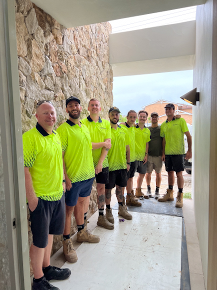
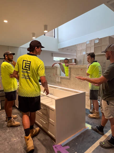
The much anticipated day for stone installation lived up to it’s hype! The Edstein team arrived onsite like an army and it was all very excited. It’s always nerve wracking watching an installation like this, hoping that everything goes to plan and we’re stoked to say that it did! What a difference the stone has made to the look and feel of each kitchen. Our vision is finally coming together…
When designing a kitchen in particular, we love to create an island bench that feels like a piece of furniture and to achieve this we love incorporating timber legs. We’ve used the same timber leg profile for our last few builds so this time we wanted to do something different. We opted for a more classic and refined style by selecting a pre-made turned timber leg – something a bit different which we always find refreshing.
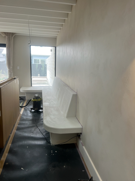
We’ve always found a built-in bench seat saves on floor spaces whilst also creating a point of interest. So for these homes we have designed and built an L-shaped seating area and finished it off by continuing the same microcement treatment that runs along the hallway walls. The backrest angle was Kyal’s decision and he’s nailed it – everyone who sits here finds it so comfortable.
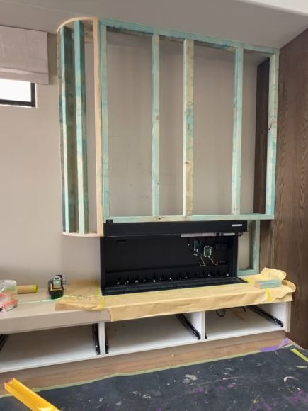
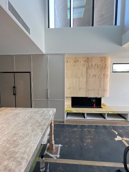
Over on the other side of the living space we’ve designed cabinetry in the same shaker profile as the kitchen to run along the entire length of the room. This not only doubles as extra seating, but includes drawer units which adds so much storage. We’ve then allowed for an electric fireplace to sit on this cabinetry which not only softens the transition from the tall cabinetry of the kitchen to the low-line cabinetry of the living space, but adds so much to the ambience.
There were a few reasons we decided to go with an electric fireplace for these builds. Number one: the ease of installation. They’re super easy to install and all that is required is a powerpoint. Number two: unlike a wood fireplace, you can control the heat output by selecting the exact temperature you wish. And number three: you don’t need timber or kindling – you can enjoy the ambience at the click of a button, without the mess. When looking into electric fireplace options we can tell you they are not all created equal in terms of how realistic the flames looks – we landed on the Real Flame Ignite XL Bold as we loved the sleek design and the flame looks super realistic.
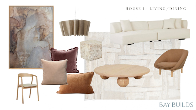
Initial Globe West furniture mood board for House 1 featuring art from Olive et Oriel and a Miss Amara rug
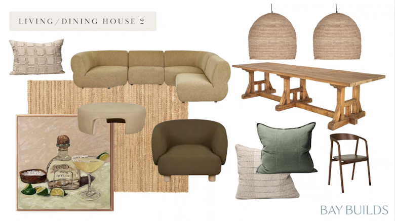
Initial Globe West furniture mood board for House 2 featuring art from Olive et Oriel and a Miss Amara rug
Now, all that’s left to do is to bring in all the furniture and styling! We’ve used Globe West furniture and couldn’t be happier with the end result. To check out all the finished shots and details of all the products and suppliers, click here.
Want to see more of Bay Builds? Click HERE
Bay Builds series is proudly brought to you with the support of RAMS Home Loans.
